Writing

Not Quite Still Life

Working with words means one spends quite a lot of time turning them over and moving them around, fitting and refitting them together like stones in a wall. Thinking is a cerebral, iterative process that lends itself, oddly enough, to physical motion. Years ago in grad school, I used to write for an hour early in the morning before showering, and tease out ideas while shampooing my hair. While biking downtown to teach, I map out lectures between traffic lights, sometimes becoming so preoccupied that I’ll forget to turn down Yonge toward campus. I’ve done a lot of writing on trains, and out in the woods, and down along the lake. If I am not moving while writing, ideally there will be other things in motion: a river eddying around rocks, trees twisting in a wind, snow falling fast and slantwise.

A pandemic is a study in stasis, and after a year spent working from home there have had to be accommodations. After months spent livestreaming lectures from my office I’ve abandoned that space, opening up my laptop in the living room, or in the sitting room on the third floor, or even at an old secretary desk in the spare bedroom. In each room I’ll work for a while before getting up to check the fridge, or look out a window, or check the mail. A neighbour comes out of her house. The recycling bins need bringing back in. Hoisted by cherry pickers, city crews are trimming street trees. A cat wants out. A cat wants in.

In the house, winter light illuminates the undersides of things, and so I get up to look. This wooden shelf, hung in a corner by the bay window, glows between snow squalls in the pewter afternoon light. There is a story to every piece here. The shelf itself I found discarded at curbside around the corner five or six years ago. It is handmade, probably a project piece made from instructions in a DIY magazine published not long after the War. The sage-coloured candlesticks, jam pot, carved wooden bird and vases are from my mother.

I bought the two leather-bound books on the middle shelf for a dollar each at an Eastern Ontario yard sale many years ago: one (published in 1829), is a life of Alexander the Great; the other (dated a decade later) a life of Peter the Great (the volume on Alexander the Great has a folio-sized fold-out map of the Middle East and Central Asia). I found the brass owl and squirrel figurine on the shelf at Value Village. The two books lying on their sides are fascinating. The first, John Ruskin‘s Ethics of the Dust: Ten lectures to Little Housewives on the Elements of Crystallization, is a Socratic-voiced manual of geology, minerology … and metaphysics. Ruskin was a leading Victorian thinker who was influenced by Darwin and very much interested in education (including the education of women) and independent thought. The other volume, The Blind Farmer and his Children, is a nineteenth century ‘improving’ novel originally published in 1817 (my copy “awarded to William Meikle as a prize for regular attendance,” by teacher Agnes Morrison on 27 June 1872). Ethics of the Dust was a gift from my mother; I found The Blind Farmer and His Children among her books after she died. The green china deer came from the Leslieville Flea; the double-decker bus from an eastern Ontario flea market.

On the bottom shelf are my Mother West Wind books from childhood, some little books I like to look at (The Observer’s Book of Furniture, The Observer’s Book of Architecture, two ‘Mr. Cuthbert’s’ gardening guides from the early 1950s, and A Flower Fairy Alphabet.), and a small green pitcher I spotted on the shelf a year ago at Value Village and left there, regretting the decision as soon as we left the store. A week later it was still there, and came home with me.

I look upon these treasures, illuminated in the pewter light. The snow squall ends, the light shifts. It’s time to return to work.

Not Quite Still Life Read More »

A Piece of the Storm

“From the shadow of domes in the city of domes,
A snowflake, a blizzard of one, weightless, entered your room
And made its way to the arm of the chair where you, looking up
From your book, saw it the moment it landed. That’s all
There was to it. No more than a solemn waking
To brevity, to the lifting and falling away of attention, swiftly,
A time between times, a flowerless funeral. No more than that
Except for the feeling that this piece of the storm,
Which turned into nothing before your eyes, would come back,
That someone years hence, sitting as you are now, might say:
“It’s time. The air is ready. The sky has an opening.”

[Strand, Mark, 1998.A Piece of the Storm. From Blizzard of One. Knopf: 20.]

For twenty years I have loved this poem, the first of many of Mark Strand’s poems and essays I have read and loved. I have the book, with the clipping of the newspaper article in which it first appeared to me tucked into it. I remember the stillness it left in its wake.

For me the “city of domes” was and will always be Kingston, Ontario, where I lived within sight and shadow of its cathedrals. I first read the poem in another city, sitting in a chair in a south-facing window with the domes of another city shadowed and sunlit in the distance.

I awoke this morning with the certainty that has risen in me for months:

It’s time. The air is ready. The sky has an opening.

A Piece of the Storm Read More »

The Return of Chartreuse

greencrayons_1_11Feb2016Years ago, as a child and young teen, I would occasionally read books in which the colour chartreuse was mentioned, almost always disparagingly. In the pre-internet age it was not something one could just Google, and it never occurred to me to look it up in the Encyclopaedia Britannica or any of the large dictionaries we had at home. As a result, for years I equated ‘chartreuse’ simply with “ugly colour.” In my mind it inhabited a hidden section on the colour wheel somewhere near “puce,” whose particular hue was similarly  a mystery (it turns out that “puce” comes from French, to which it translates literally as “flea;” hence the unpleasant squashed-red-brown it denotes.

Chartreuse, I have learned, is a liqueur produced by French monks of the Carthusian Order since 1737. The liqueur–reportedly distilled from 130 herbs steeped in alcohol–takes its name from the Chartreuse mountains in the Grenoble region of southeast France. The mountains are beautiful and verdant, and seem to glow in the very green-and-yellow shades that give both Chartreuse liqueur (which comes in both green and yellow) and the colour its name.

And somehow, in the manner of all things, the colour chartreuse eventually made its way to America as an affectation, first as a jellied dish made with Chartreuse liqueur (somewhat infamously, it was reportedly served as a First Class dessert on the Titanic) and later, as a staple of the Hollywood Regency style of interior design popularized by Dorothy Draper.

By the seventies, chartreuse–still in wide use in both fashion and interior design–had become a kind of caricature of itself. In 1972 Crayola introduced a chartreuse crayon as part of its fluorescent series, enabling children to combine incompatible colours as well as any grown-up hippie might–but even then more muted shades of green (most notoriously avocado) and contrasting primary colours had begun to dominate the design world. By the eighties chartreuse was distinctly dated, and in 1990 Crayola quietly withdrew the chartreuse crayon (the new name was ‘laser lemon’).

Recollections of my late seventies-to-mid-eighties childhood are, of course, redolent with memories of avocado, and from time to time at a thrift store I still come across (and bring home) the odd brightly-hued polyester dress in chartreuse and, say, deep purple.

Not that I think of it as chartreuse, a colour whose overuse followed by denigration and cultural erasure has been so complete that the word has never been a natural part of my vocabulary.

*

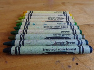
This morning I dug through my daughter’s box of crayons, looking for chartreuse. I found it in a crayon labeled “green-yellow.” This is actually an utterly accurate description of chartreuse, which exists precisely at the midpoint of green and yellow.

While picking through my daughter’s crayons, I began thinking about the names Crayola chooses for its colours, and started to see them as cultural artifacts. Current colours, such as “fuzzy wuzzy brown” and “macaroni and cheese” seem to suit the current generation of children raised on daycare and cartoons about as well as “chartreuse” and “maize” might have fit kids growing up in the seventies.

Crayola has a long history of renaming its crayons, and sometimes this has been done done for obviously good reasons. At the same time, while records (of controversies, if nothing else) exist for these somewhat politicized changes, the subtle shifts in uncontroversial colour names arguably tell an equally important story. [Scholars interested in a critical assessment of Crayola colour changes, including the “flesh” controversy, might want to read Lorna Roth’s fascinating essay, “Home on the Range: Kids, Visual Culture, and Cognitive Equity” in Cultural Studies<->Critical Methodologies,; 9(2): 141-148 (2009).]

There is apparently a move afoot to abandon colour names. While I (and presumably IKEA) can see the obvious utility to such a thing, I think abandoning colour names entirely would be a terrible shame. Crayon (and paint and design) colours are meaningful cultural artifacts. They are records of our shifting preoccupations, and proclivities, and aspirations.

I wonder, a little, how future crayons will be named. I can easily imagine Chador or Raven, or Masala (in place of burnt sienna), or Polar for the pale blue shade of Arctic ocean meltwater currently called light blue.

I wonder, too, if some of the old colours might make a return. Chartreuse, for example, has made a hipster-ironic reappearance in the design world. The liqueur for which the colour is named has also come to the attention of Brooklynites tired of Absinthe and, reportedly, Jagermeister. Soon enough, Chartreuse jelly will undoubtedly appear on the menus at Waldorf Schools all across the land, and at some point Crayola will have no choice but to dredge up Chartreuse from the archives.

Perhaps at the same time it will make a little bit of room for puce.

The Return of Chartreuse Read More »

Stopping by Woods

Early morning; the hour before dawn. And the house is silent; the cedars dark shapes and stillness under their weight of snow.

And here am I, words at the ready, (now formally) writing another book. The sense of propulsion and purpose, an idea unfurling into its essence. All these living ideas, assuming their shape.

Unlike the Imagining Toronto book, which announced itself like an architectural edifice, this new project is taking shape in a different way. It unfolds like something fully organic. The pieces of it stir and rustle against one another, and it is hardly a surprise to see that they are green.

My hands in the soil; the smell of earth. That green universe; the one I have always waited for, drifts outward and opens a little.

I look up, and suddenly the sky is filled with light.


Stopping by Woods Read More »