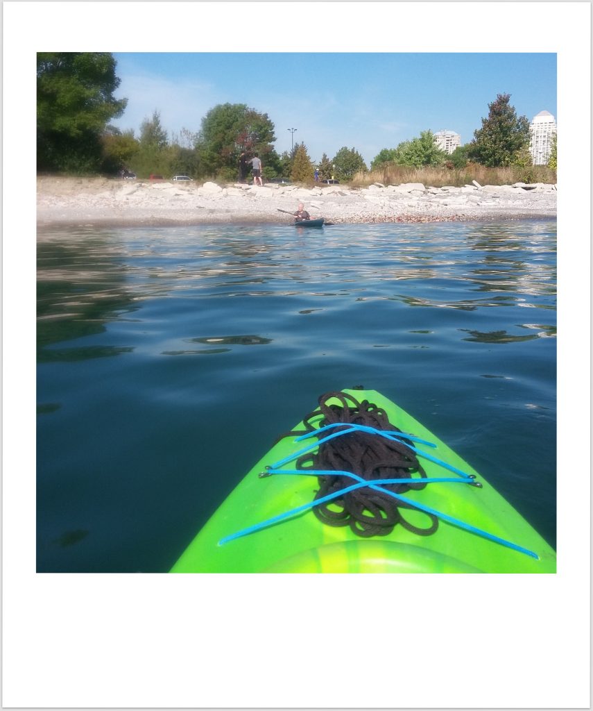
This morning’s forecast–one last sultry, sunny day before fall weather descends–was enough reason to drop everything, toss our kayaks on the car, and spend a day on the water.
We put in at Humber Bay Park West and paddled west about 5 km to Samuel Smith Park. The sun beamed down; the breeze was mild; the lake warm, the swells gentle. We had a picnic and watched the downtown towers glitter, 15 km away. Paragliders rose and descended in the middle distance. Dogs dragged driftwood along the beach. Endless Summer, for one more day.
We surfed the swells all the way back, the lake just beginning to roil. The haze closed in; thunderheads loomed behind us. In the parking lot crickets were abuzz with the news: a storm, oncoming. Endless summer, for one more hour.
We made it home before the rain, and made pizza for dinner, savoring our sore shoulders and October sunburns.
This morning when I woke up, the house was cold. I went around, closing windows and doors. The sunrise was fuchsia, signalling a change in the weather, a shift in the season.
At mid-morning the air is cool and breezy. There are cardinals in the cedars, and finches at the feeders. The east-facing tips of the trees are turning colour, and the gutters are littered with leaves.
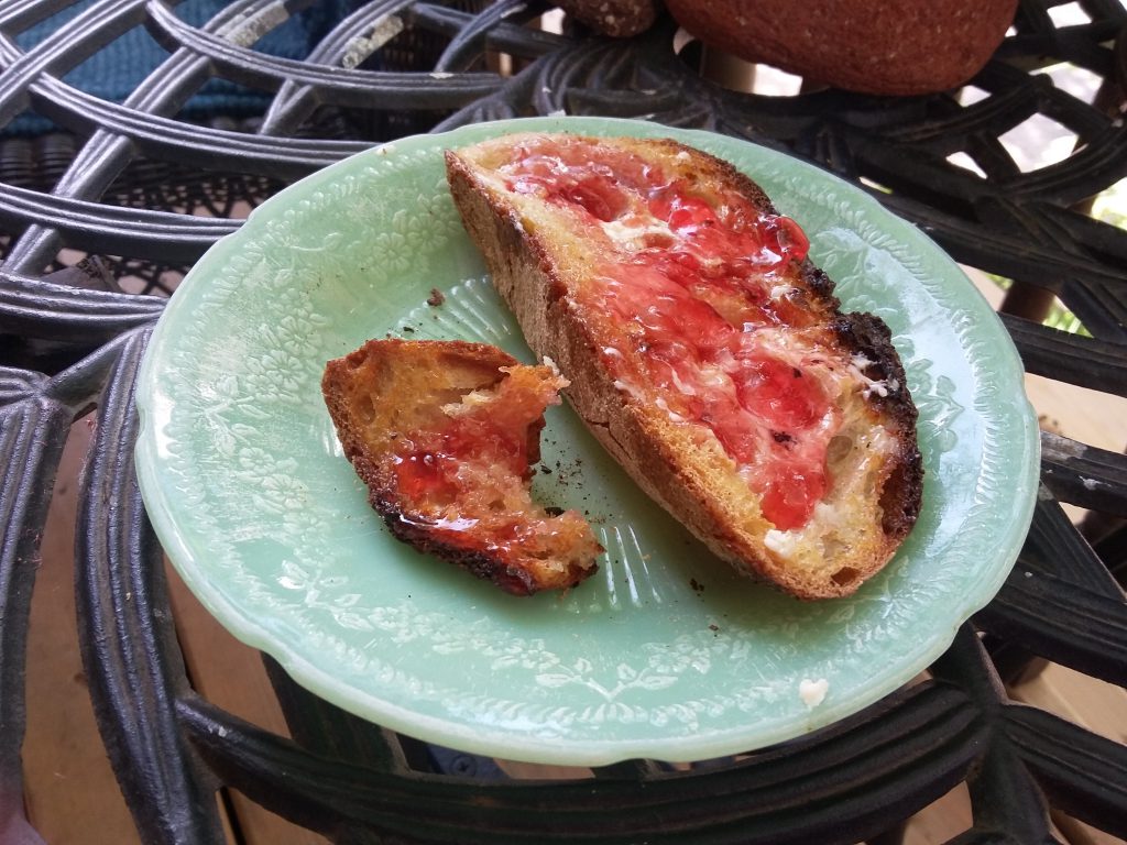
For breakfast I had wild apple sumac jelly on toast. A warm treat on a chilly morning. A good day for seasonal tasks of keeping: sorting the mittens and scarves, decorating the front porch for Thanksgiving, making a rustic apple pie. Rosh Hashanah begins tonight at sundown: Shanah tovah um’tukah to all who will celebrate.
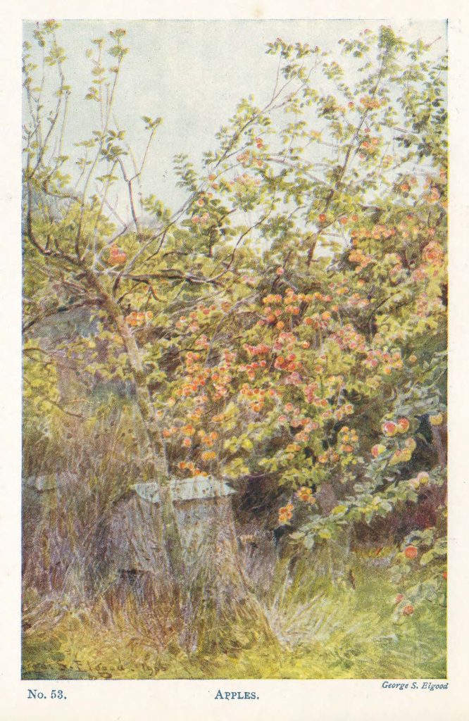
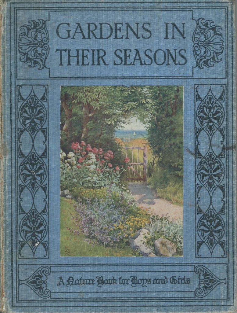
The picture above is from an old book, Gardens in their Seasons, published in 1912 (my copy a 1919 reprint). This is a charming, gently instructional book, written for young readers and wonderfully illustrated. I bought my copy at The Monkey’s Paw moving sale in the spring, and have kept it on my desk ever since, consulting it nearly as regularly as one would a book of days.
Of fall, the book notes, “Autumn has come; it is the time of ripening. [….] The hush and the stillness of late summer has been broken.” During this season, the book explains, the trees and flowering plants expend the last of their energy generating seeds to be spread by passing creatures or the wind. Readers are invited to “gather the prettiest and the best of the coloured leaves of the autumn,” to press into biscuit tins between layers of sand to dry and preserve their rich colours.
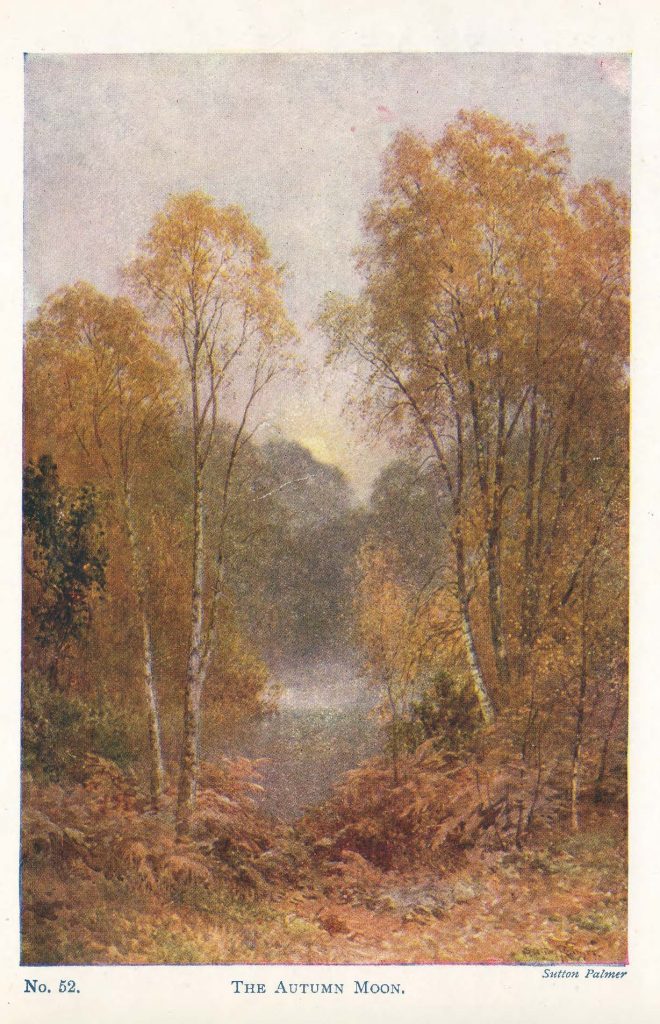
There is melancholy in the air, when soft days give way to chilly nights and the moon rises silently above the trees, overseeing this time of gathering in, this season of contemplation.
A few days ago, while preparing staghorn sumac to dry for the winter, it occurred to me that sumac–whose tart berries, processed into a powder, are popular in Middle Eastern cooking and were once culinary and medical staples in First Nation and subsequent settler households–could make an interesting jelly.
Staghorn Sumac
Staghorn sumac–Rhus typhina–is a medium-sized shrub native to the Great Lakes region. Thickets of sumac, easily identified by fuzzy, antler-like branches, bright conical drupes ripening in late summer, and brilliant scarlet fall foliage, are a familiar sight along Ontario waysides. There is a popular belief that sumac is poisonous, but most varieties are not toxic, and staghorn and other edible varieties of sumac have a very long history of culinary, medical and social-ceremonial use. Sumac is reportedly a very high source of vitamin C: its most common traditional culinary use in North America is in a tart, cooling lemonade-like drink. In Middle Eastern cuisine, powdered sumac is nearly ubiquitous as a spice or condiment, and is well known as a principal ingredient in za’atar, to which it bestows its dark red colour and tart citrus-like taste.
Medically, sumac is reported to be a useful topical antiseptic and coagulant, and to have been widely used in traditional First Nations medicine. Sumac is also reported as an important ingredient in kinnikinnick, an herbal preparation used in social as well as ritual smoking. Among the print sources I have consulted so far, Robert K. Henderson’s The Neighbourhood Forager (Key Porter, 2000) offers the most detailed inventory of sumac’s reported traditional medical uses.
Sumac also has high concentrations of tannins, and the leaves and bark of certain sumac varieties have been widely used in Mediterranean leather-making for many centuries. In his fascinating, excellent book Make Ink: A Forager’s Guide to Natural Inkmaking (Abrams, 2018), Jason Logan passes over sumac in favour of black walnut for brown ink and pokeberry for a true red, but staghorn sumac’s ready accessibility, high tannin content and relative (certainly to the reportedly toxic pokeberry he chooses for its reliably crimson ink) make it a good option for experimentation with colour. Toronto container gardening expert Gayla Trail has reported success with using sumac berries to produce red dye, and the US Forest Service includes sumac as a traditional red dye source in its ethnobotany database.
Note: I am a geographer, not a botanist, and have an amateur-level knowledge of sumac, its uses, potential allergy interactions (sumac is reportedly related to the cashew plant and at least one source links it to mango) and potential risks. Before using sumac or any other wild plant, it is important to do your own research relying on high quality published sources.
Note also: In the Toronto area, sumac drupes usually reach peak ripeness in August or early September. The drupes are best if picked before rain. To avoid potential particulate contaminants from fuel exhaust, it is best to pick sumac away from busy highways. If you wish to harvest sumac, please trim the drupes carefully with a sharp blade rather than tearing them from the tree. Take only a few drupes from each tree, and leave plenty for wildlife.
Wild Apple Sumac Jelly
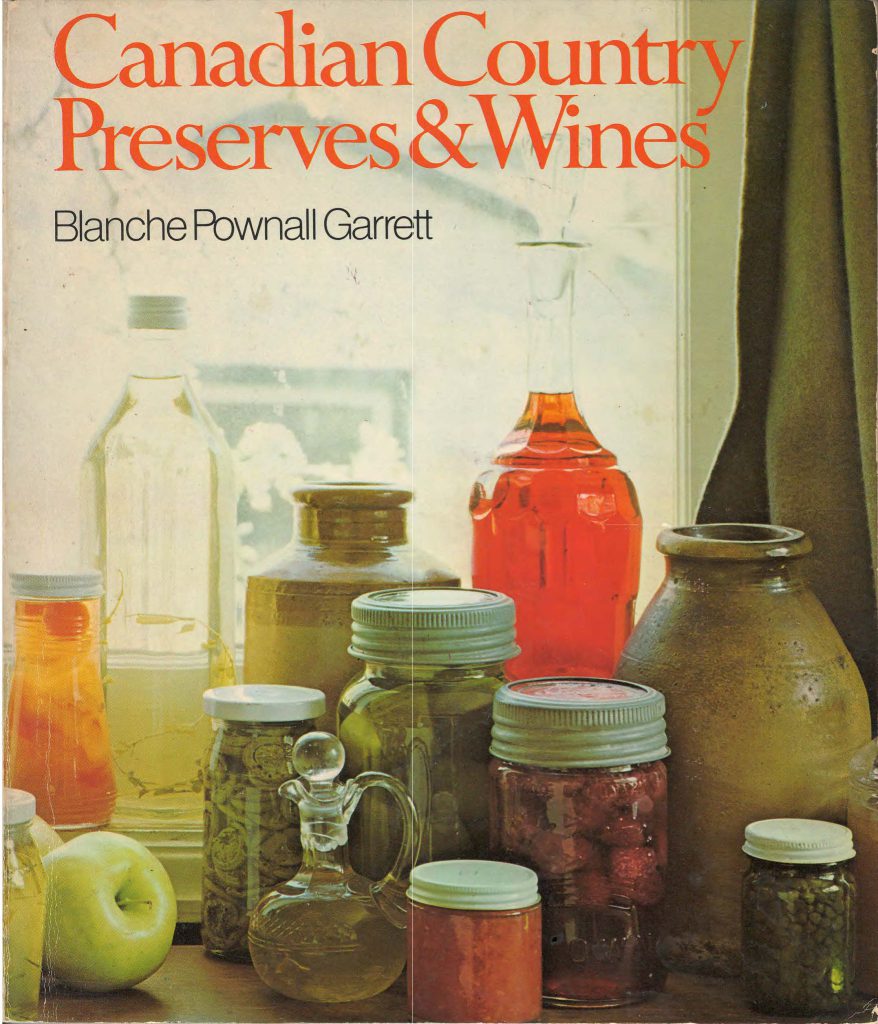
Sumac jelly references in published works are uncommon. My sumac jelly recipe is a modified version of a one published in Blanche Pownall Garrett’s Canadian Country Preserves & Wines (James Lewis & Samuel, Publishers, 1974), a book focusing on early settler foodways in Canada and early Canadian recipes. Sarah B. Hood’s excellent preserving guide, We Sure Can (Arsenal Pulp press, 2011), also includes a tested sumac jelly recipe that uses apple pectin, a natural alternative to commercial pectin. [Her book also includes an easy-to-make apple pectin recipe.]
Apple sumac jelly has a bright claret colour and a tart taste. The batch I made is delicious on sourdough toast. I plan to use it in place of cranberry sauce at Thanksgiving, as it seems to me it would suit turkey or chicken wonderfully. It would also be an ideal accompaniment to cheese.
Please note that I am an amateur and my recipe is based on a first-time experiment. For next summer’s batch I will almost certainly adjust it. If you are interested in trying sumac jelly, I recommend starting with the tested recipe in We Sure Can.
Ingredients
Sumac berries, 8 cups (from 8 to 12 whole drupes) Wild or tart apples, 4 cups, stemmed and quartered Water, about 12 cups Commercial pectin crystals, 1 package (I used Certo) Granulated sugar, 8 cups Lemon juice, 1/4 cup (this may be optional, as the apples and sumac seem sufficiently acidic for food safety, but I included it to be sure)
Instructions
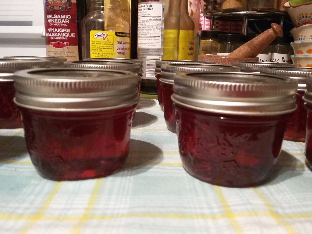
** This recipe makes 13-15 125 ml jars of apple sumac jelly (or 7 to 8 235/250 ml jars). It relies on well-established hot water canning techniques and easy-to-obtain equipment.**
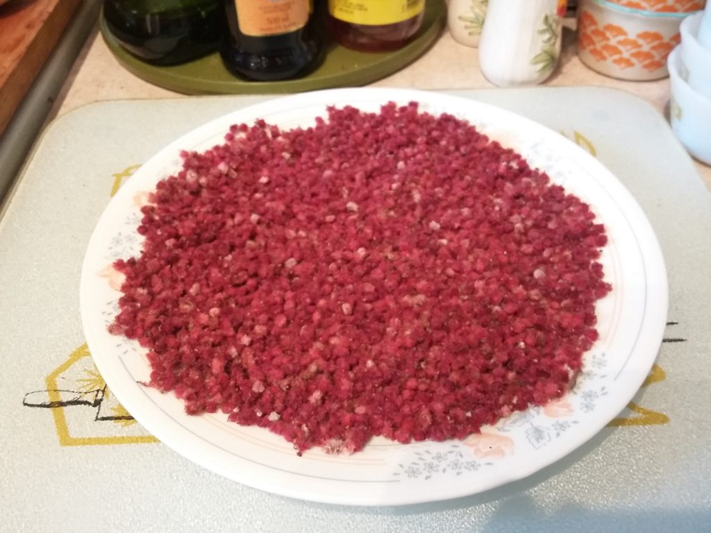
Remove sumac berries from drupes. This is easily and fairly quickly done by drawing a fork downward through the drupes until the berries pop off. Some recipes recommend boiling the drupes whole, but it is my understanding that the stems are higher in tannins than the berries, and it is also easier to boil and process the sumac berries off the stem. A large sumac drupe can produce about 1 cup of berries.
Prepare jars in water bath canner: Wash jars and two-part lids in warm water with soap (I use Bernardin–Ball in the US–jars and lids with screw bands, which are readily available and highly reliable). Place jars in canner. Cover jars with two inches of water and bring to full rolling boil. Boil for 10 minutes. After boiling, turn off heat. Leave jars in, and drop in lids and screw bands. Remove just before filling with jelly. [Note: canning supplies, including large, non-reactive pots, jars and lids, funnels, jar lifters, magnetic lid lifters, etc. are sold inexpensively at Canadian Tire.]
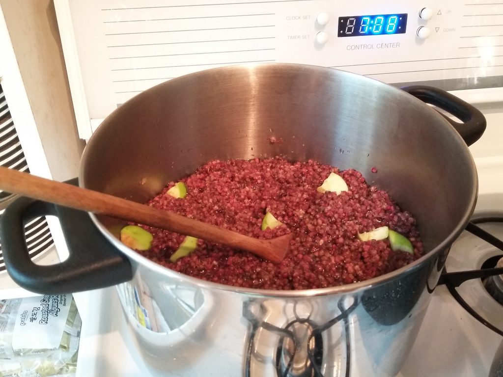
Place sumac berries and apples in a large, *non-reactive* (e.g., stainless steel) pot. Cover with water, cover pot, and simmer until apples are soft, 15 to 20 minutes, stirring occasionally.
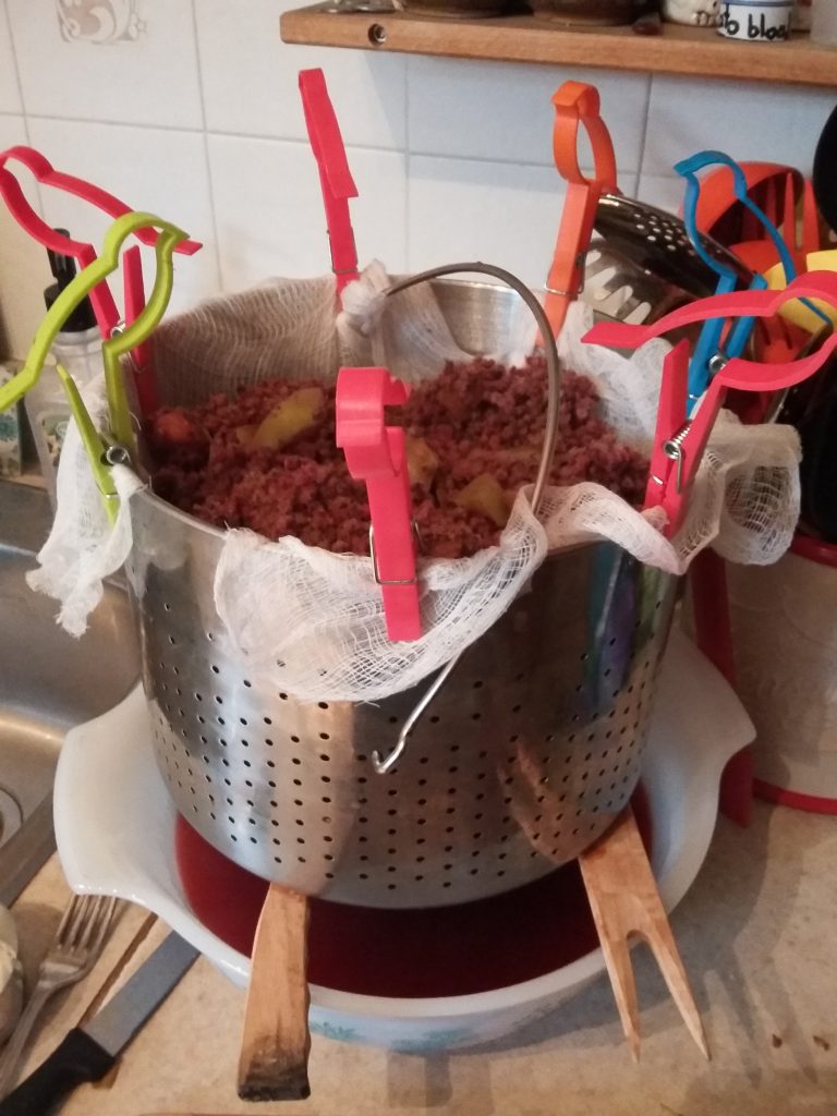
Using a sieve or colander lined with cheesecloth or a jelly bag, strain out liquid into a large bowl. Do not press or squeeze as it may make the jelly cloudy. If fine sumac hairs flow through the cheesecloth or jelly bag, sieve a second time. This should produce about 7 cups of apple-sumac liquid, a deep burgundy in colour.
Measure out 8 (yes, eight) cups of granulated sugar. [Note: if this seems like a lot of sugar, consider how jams and jellies are used: a spoonful at a time. Amortized over a year, especially if your diet is mainly healthy, this is a small quantity of sugar to add to your day, and is a lot less harmful than the high fructose corn syrup found in most commercially processed foods. If it still seems like a lot, low-sugar commercial pectins are available, as are homemade pectins. I have not tried them and cannot report on their efficacy at this time. I am not a fan of artificial sweeteners, however.]
Measure out 7 cups of liquid and pour into large, non-reactive pot (it is worth rinsing the pot first to remove any stray sumac fuzz). Stir in one package of pectin crystals (I used one 57 gram package of Certo brand pectin crystals). Bring to boil.
Pour in 8 (yes, 8!) cups of granulated sugar and 1/4 cup lemon juice (the lemon juice may be optional, as tart apples and sumac are high acid on their own) and return to a boil that cannot be stirred down. Boil hard for one minute or until the jelly’s set or gel point is reached (a candy thermometer showing 220 degrees Fahrenheit is one method; pouring out a few drops onto a cool plate to see if they ‘gel’ is another).
Remove and drain sterilized jars. Fill carefully with jelly mixture using canning funnel, leaving 1/4 inch head space. Using a non-reactive stick (I use a wooden chopstick), make sure there are no air bubbles trapped in the jelly. Carefully wipe rims of any stray drops (which may interfere with sealing). Carefully place lids on jars without touching their underside (this is why a magnetic lid lifter is a valuable tool). Spin on screw bands until resistance is met but do not overtighten.
Place jars in hot water bath. Jars should not be touching or tilted (when I make a larger bath of jam or jelly, I process the jars six or seven at a time, to ensure they all seal properly). Place lid on pot. Bring to a full-rolling boil and boil for 10 minutes (at elevations above sea level, you will need to boil longer: there are many guides online for boiling times at various elevations). After 10 minutes, turn off heat.
Using jar lifter, remove jars from hot water bath. Do not tilt, and do not touch or press lids. If the jars have sealed, the metal lid should ‘pop’ down audibly (this may take a few minutes). Do not touch for at least 12 hours. Jars that do not seal should be refrigerated and used within a week or two. Sealed jars should keep for a year, subject to the usual cautions about preserved foods.
Note: ‘traditional’ canning techniques involving paraffin wax, turning jars upside-down or using certain kinds of jars are no longer recommended as they do not meet contemporary food safety guidelines. The Government of Canada has published a very good overview of home preserving safety guidelines.
And also note: only low acid foods–foods whose combined acidity is less than 4.6 pH–can be preserved using water bath canning techniques. According to my research, apples usually have a pH under 4, and sumac has a low pH of about 2.5.
Sumac for Za’atar
My own introduction to sumac as an edible plant came in a recipe in a Middle Eastern cookbook that called for za’atar. I make fairly extensive use of (mainly European and North American) culinary herbs and spices, but had never heard of za’atar. Za’atar, it turns out, is quite easy to make at home–provided one has access to dried sumac. Fortuitously, I learned about za’atar in the early fall, when ripe sumac were still at their peak, and simply biked down to the lake to pick a few drupes for processing. Now, late every summer I pick a dozen or so sumac drupes to preserve for the year ahead.
Ingredients for dried Sumac
Ripe sumac drupes, about 8 to 12
Instructions
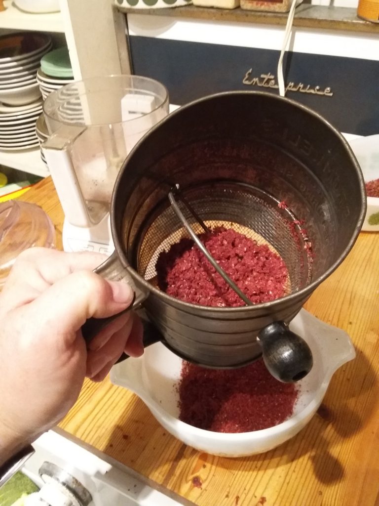
Strip berries from stems. Air dry in a wide, shallow dish for 1 to 2 weeks, turning occasionally.
In a food processor, pulse berries to separate fluff from seeds.
Using a food mill or sieve, separate berries from seeds. When completely dried, store in an airtight jar for up to a year.
For Za’atar
Note: dried sumac can be used on its own as a flavouring or condiment. In my experience its flavour becomes richer and more complex with storage. I use it whenever I make a Middle Eastern dish, and especially like to swirl it into the yoghurt sauces and dips that accompany many such recipes.
There are numerous recipes for za’atar available online. Za’atar and sumac are also available at many larger spice shops. I have read that in Israel and Arabic countries, most households will prepare their own blend, so it is worth experimenting.
Ingredients
Dried sumac Oregano Marjoram Thyme Sesame seeds Salt
Instructions
Grind sesame seeds in a food mill or mortar & pestle.
Add additional ingredients and grind together.
Store in a sealed container.
Sumac for Drinking
There are two schools of thought on ‘sumac-ade’ or ‘sumac lemonade.’ The first suggests boiling the sumac berries with sugar to produce a syrup-like infusion. The second recommends against boiling sumac on the grounds that boiling will release tannins and produce a bitter taste. Interestingly, both techniques involve about the same quantity of sugar and in my experience produce a similar-tasting sumac drink. Simmering takes a bit longer, but ensures the sugar is fully dissolved and produces a richer, more complex, syrup-like flavour. But for a quick sumac drink, processing sumac berries and then infusing them into cold water or a pitcher of iced tea or lemonade seems a perfectly fine plan, and will likely preserve much of sumac’s reportedly high vitamin C content, likely degraded by heating.
For a ‘cold-pressed’ sumac drink
Sumac berries, 1 cup Sugar, 1/4 to 1/2 cup (or to taste) Water, 1-2 cups (for blending); plus enough to fill a pitcher afterward
In a blender, process sumac berries and water together until sumac berries are fully separated from seeds and liquid is quite dark. Strain liquid through muslin into a pitcher. Add sugar and water to fill pitcher. Stir well and serve.
For a boiled sumac syrup
Sumac berries, 2 cups Sugar, 1-2 cups water, about 4-6 cups Optional: 1-2 tart apples, quartered
Place sumac berries in a non-reactive pot. Cover with water and add sugar. Bring to boil; lower temperature and simmer for about 10 minutes until berries are softened and mixture is dark and aromatic. Let cool. Strain liquid through cheesecloth to separate seeds and sumac hairs. Refrigerate. If covered and refrigerated, syrup should keep for up to a week. Add 1-2 tablespoons to a glass of water, or 1-2 cups to a pitcher for a sweet-tart drink rich in vitamin C.
Sumac Mead
Staghorn sumac is rich in malic acid, making it an ideal if unexpected candidate for wine-making. I have never tried it, but this recipe for sumac mead sounds delightful and even easier than making wine. I hope to try it out next month.
A Note on Foraging
I am so pleased with the results of my apple sumac jelly experiment. For the last several years I have made increasing efforts to use local, wild and untended plants that tend to be overlooked or even unwanted in urban settings. For years we have collected mulberries from street trees to make into ice cream or baked goods, and this year for the first time I made (delicious, especially when swirled into plain Greek yoghurt) mulberry jam. Last fall I made crabapple jelly, which was incandescent and lovely in every way.
Although I grew up harvesting wild plants and learning about their uses from my mother, I am not an admirer of the contemporary ‘foraging’ movement as commonly practiced, as it seems to lack adequate awareness of the most basic principles of conservation, despite paying lip service to them.
One example of destructive foraging is the extirpation in many areas of wild leeks, or ‘ramps’ resulting from enthusiasts (or pickers for commercial sale) trampling delicate forest floors and pillaging entire groves of plants. The problem has gotten so bad that the Province of Quebec has banned the commercial harvesting of wild leeks and several US states have implemented protective legislation.
I have also seen this happen with fiddleheads, whose overharvesting has denuded entire river bottoms where they were once plentiful. This is not even a new problem: in the 1980s my mother would run commercial harvesters out of ravine beside our house, after they descended in droves with large garbage bags they’d hoped to fill for commercial sale.
There are, however, many plants, particularly in cities, that may be harvested sustainably and even positively. Garlic mustard, for example, is an invasive plant in Ontario whose leaves reportedly make excellent pesto. Garlic mustard grows readily in disturbed soil and in parks and woodlots: pulling the plants and eating their prepared leaves is a positive act of conservation.
Crabapples and mulberry trees are common street trees in Toronto, where I live. For the most part they are ignored, except when their fruit falls on sidewalks and elicits public complaints. Picking and using their fruit is an excellent way to positively rethink their presence in cities.
There are numerous good published guides to edible wild plants: I have listed some in the Sources section at the end of this post. If you do good research, and if you harvest carefully and sustainably, it is possible to enjoy the fruits of the wild city.
Some Sources
Berglund, Berndt and Clare E. Bolsby, 1971. The Edible Wild. Pagurian Press. [A very good, reliable guide to wild plants in Canada and the US.]
Coon, Nelson, 1957. Using Wayside Plants. Hearthside Press. [A very good book on using wild plants for food, medicine, art, and crafts. If you can find any edition of this long out-of-print book second-hand, you are in for a treat.]
Garrett, Blanche Pownall, 1974. Canadian Country Preserves & Wines. James Lewis & Samuel. [A book exploring traditional Canadian foodways and recipes.]
Gibbons, Euell, 1962. Stalking the Wild Asparagus. Alan C. Hood & Company. [The ‘classic’ forager’s guide; highly worthwhile reading although not always reliable, and I have a few issues with material that appears borrowed from other published works.]
Henderson, Robert K., 2000. The Neighborhood Forager. Key Porter Books. [A very good introduction to urban foraging.]
Hood, Sarah B., 2011. We Sure Can: How Jams and Pickles are Reviving the Lure and Lore of Local Food. Arsenal Pulp Press. [An indispensable guide for anyone new to home preserving. Includes many tested recipes.]
Logan, Jason, 2018. Make Ink: A Forager’s Guide to Natural Inkmaking. Abrams. [A simply wonderful book about using wild, native plants to make inks.]
Moncrieff, Helena, 2018. The Fruitful City. ECW Press. [Moncrieff mentions sumac only in passing, but The Fruitful City offers a compelling case for making good use of the fruit trees that grow practically untended along urban streets and alleys.
Every morning, shortly after dawn, I go up to the third floor deck to tend to the garden, sniff the scents of the new morning, and take a census of my horizon of trees.
Every morning has a different scent. This morning the air had a northern, almost September smell, until the sun breached the horizon. Yesterday the air was redolent with woodsmoke, drifting upon a wind that soughed in the cedars. The day before that the air smelled of the lake. In the hour after dawn the city, or my part of it, is silent. No traffic sounds, no sirens, not even an airplane. This morning the air is perfectly still, and only the birds and I are present to sing the morning open. The air is scented with ailanthus blossoms, opening about a week later than usual but as secretive and summery as ever.
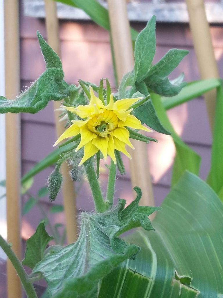
Unknown heirloom tomato cultivar with complex blossoms.
This year I am growing at least five varieties of tomatoes, including “Summerlast’ (early-fruiting patio-sized supposedly long-fruiting determinate tomato plants, of which I have six plants going), ‘Rapunzel’ (a newish hybrid tomato that reportedly grows long, gorgeous tresses of cherry tomatoes; this is by far my tallest tomato plant so far, heading for five feet already as it begins to flower), San Marzano (two very sturdy plants, both flowering now), an unknown (because I failed to save the labeled starter pot) tomato plant I bought at the Junction Farmers’ Market, and several ‘heirloom’ tomatoes.
‘Heirloom’ is a bit of a misnomer, as there are many heirloom varieties of tomatoes. Heirloom or heritage tomatoes are typically open-pollinated, older, non-commercial cultivars. Reportedly they tend to lack the disease resistance and uniformity of commercial cultivars, but in compensation they are inherently more biodiverse and interesting to grow, and produce tomatoes of sometimes wildly varying sizes, colours and shapes. My ‘heirloom’ tomatoes came labeled as such at the Canadian Tire garden centre, with the note that each plant might grow quite differently depending on its variety.
This has definitely been my experience this year. Each of my heirloom tomato plants looks quite different. All are vertically inclined, although not rampantly so, and their leaves and blossoms are somewhat idiosyncratic. My favourite, so far, is the heirloom tomato pictured above, whose leaves emerge curled and inverted, almost as if blighted, but then unfurl, completely hale. The blossoms are also unusual, large and multi-layered. I have read that large blossoms produce large tomatoes, and am looking forward with considerable curiosity to see what this heirloom plant produces.
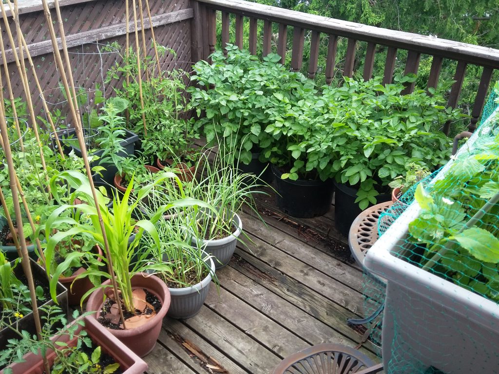
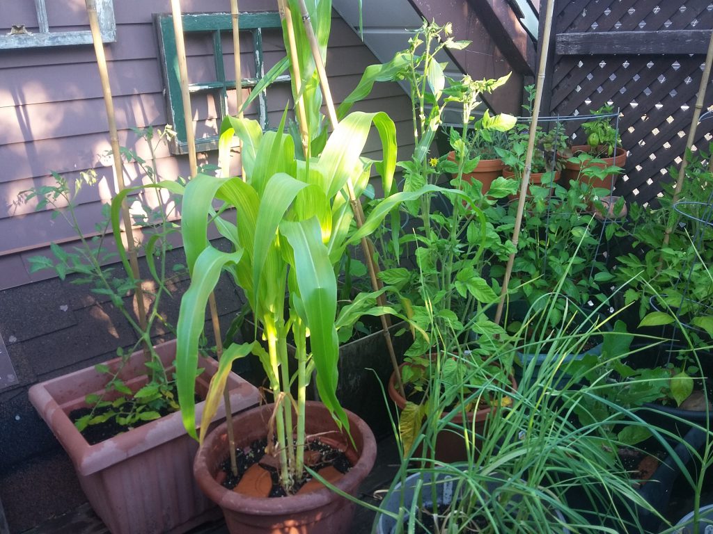
On the third floor deck I am also growing two containers of corn (this year’s wildcard), zucchinis (only two of which survived the early ravages of squirrels digging up the seeds; zucchini are supposedly easy to grow, but each year mine succumb to some new peril and/or fail to produce fruit), three large tubs of very large red potato plants, two eggplants, two sweet peppers, red onions, everbearing strawberries, garlic, and several varieties of herbs (lemon verbena, pineapple sage, lavender, basil, catnip).
Third floor back deck garden, late June 2019.
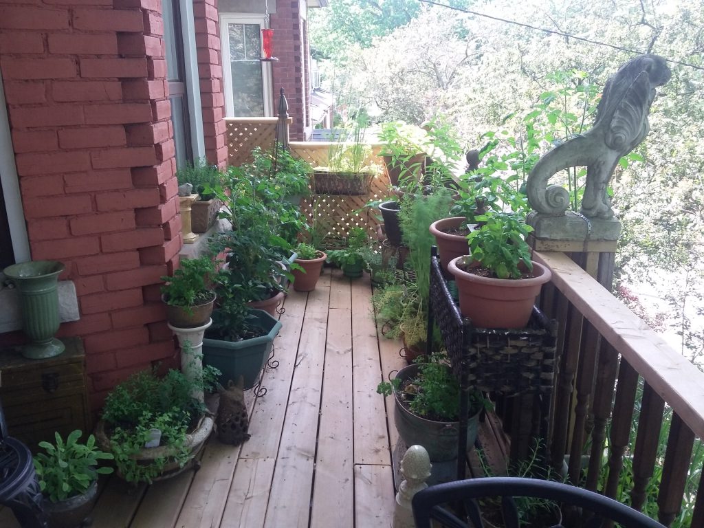
Most of my 22 varieties of herbs (this year’s herbs include lavender, basil, catnip, lemon verbena, lemon thyme, sage, oregano, rosemary, dill, tarragon, rue, summer savory, winter savory, marjoram, fennel, cilantro, parsley, pineapple sage, chamomile, sorrel, curry plant, borage) are growing on the second floor front balcony (shown below), alongside a few more tomatoes, bush beans, carrots, beets, more garlic and more red onions. Our radish have been pulled, and I haven’t yet decided whether to simply seed more dill or risk salad greens in the summer heat in their currently vacant container.
floor front balcony garden, 1 July 2019.
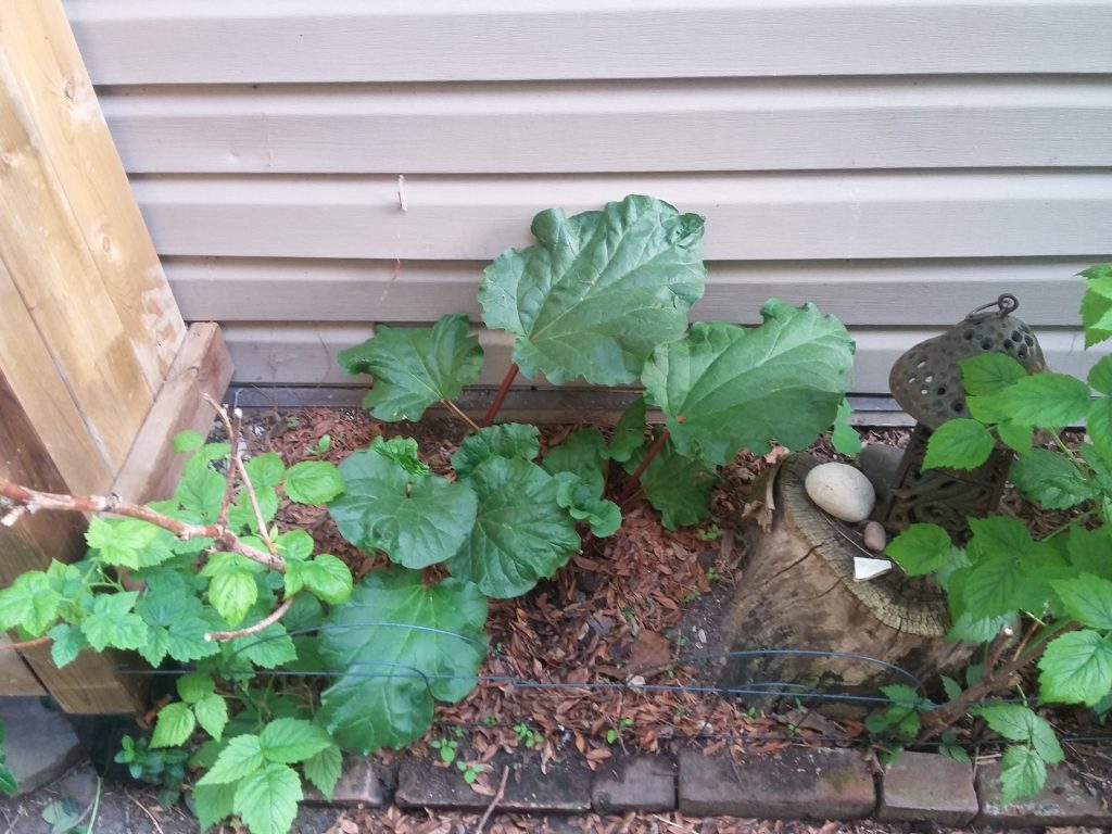
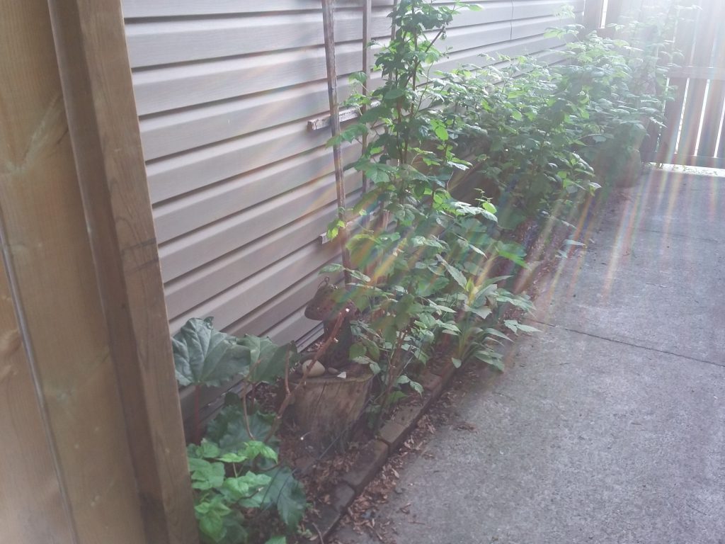
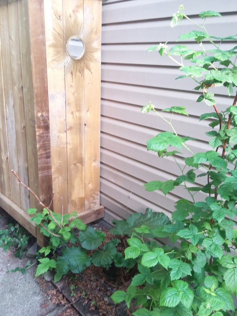
Sometimes I sorrow over not being able to grow more vegetables at ground level on our shady city property (currently our ground-level growing is limited to rhubarb, raspberries and red currants), but between patios, verandahs, balconies and decks we are able to dedicate about as much square footage to vegetables and herbs as we might manage in the soil, without the same risks of soil depletion and problems with pests.
Third floor back deck, plants aglow in the early morning light.
Still, at some point we will retire from urban life, and then I will have a half-acre vegetable garden, an arbor for fruit trees, and a kitchen garden filled with herbs.
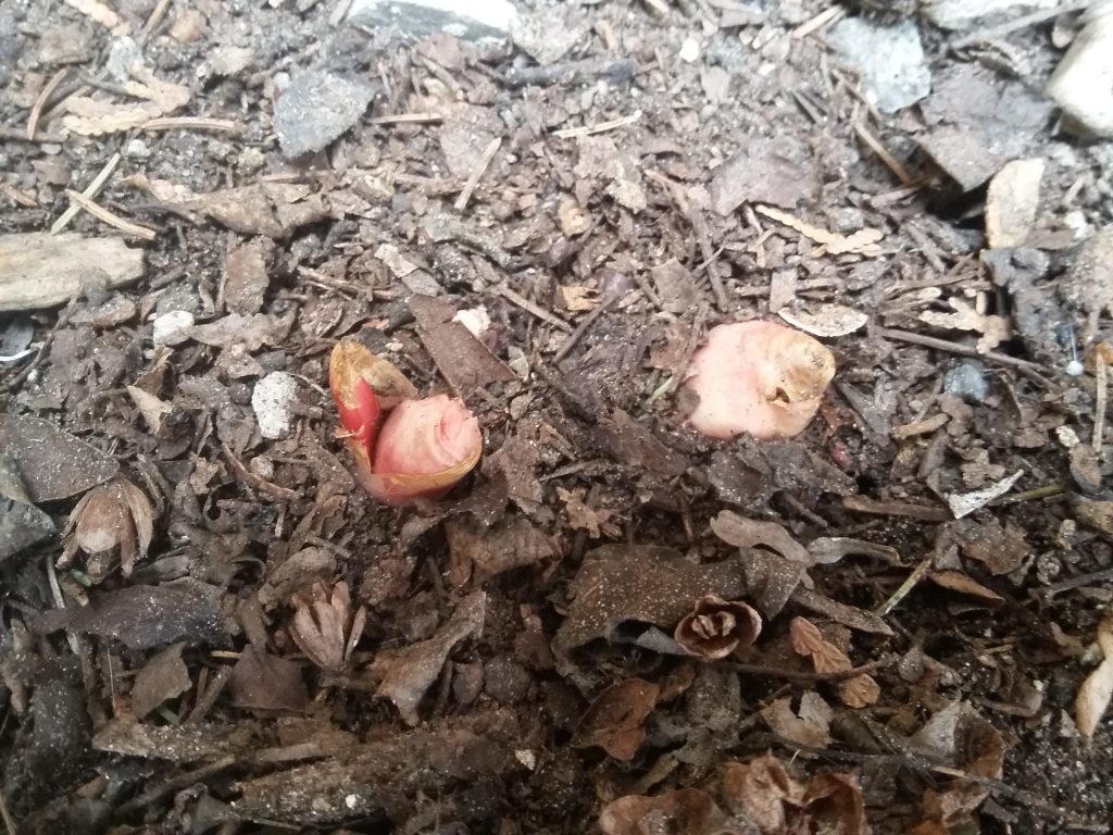
These fat nubs are my rhubarb, planted last summer and, after overwintering, poking through the soil in the narrow garden plot beside our garage and promising a first proper harvest to come in June!
Rhubarb reportedly prefers well-drained, fertile soil in full sun, but the garden plot where we have planted ours has thin, stony soil and only partial sunlight. It is also partly beneath the eave of our neighbours’ garage, meaning it receives only peripatetic rainfall. But last year it seemed to do quite well, and I’m hopeful that this year we’ll get a decent harvest.
A decade ago this stretch between our neighbours’ garage and our back walkway was dry and stony, and underlain by shards of glass and broken concrete. I resolved to turn it into a garden where I could grow raspberries, and here is what it looked like last June.
I’ve set in a row of old bricks to hold soil and moisture, and every year I amend the soul liberally with compost. To me this strip–about 18 inches wide and about 12 feet long–is evidence that almost any space can be made into a garden with a little care and a willingness to experiment. It does have limitations, though: last year we planted zucchini along here, which flowered but never fruited and eventually developed powdery mildew.
This year I would like to grow a few sunflowers along here, and am tempted to colonize the garage wall with hanging planters for lettuce or other shade-tolerating edibles.
But for now, the big news is that the rhubarb is up!